# Visual options
The module can display a visual configurator where the customer can pick different parts of the product and get a direct preview of the selected options.
In this example, we will configure a custom skateboard step by step to see how to add option groups and visual options to the designer.
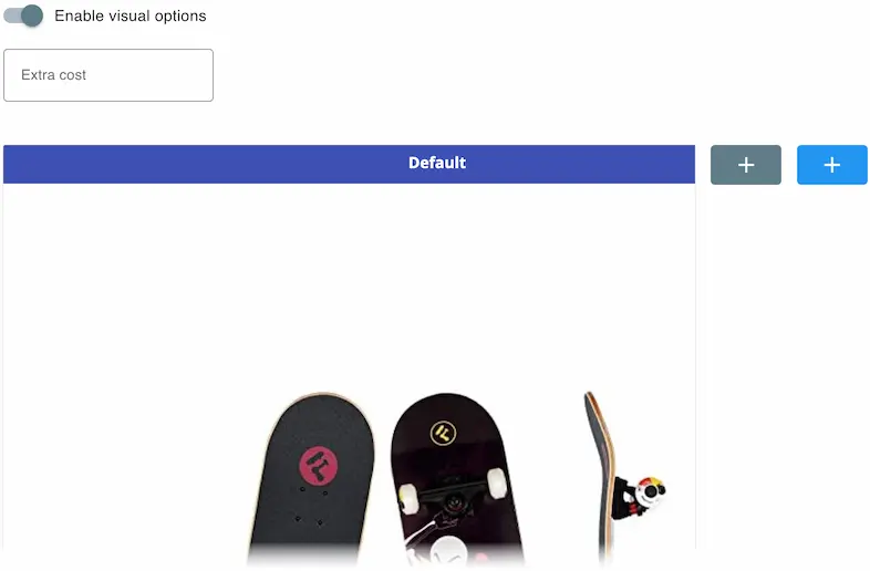
# 1️⃣ Enabling the visual options
The first step is to enable the visual options
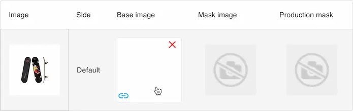
# 2️⃣ Background image
Then we will open the images tab and configure a white background to replace the base image
# 3️⃣ Option groups
We can then add our option groups
- Click this button
A new empty group will be created
- Click the group title to edit it
This modal will be displayed
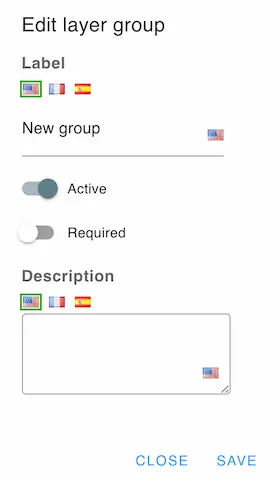
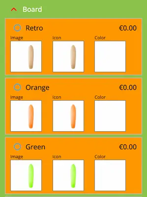
Change the title to "Board". Our skateboard will have three groups called: Board, Artwork and Wheels.
You can create the other two groups in the same way.
# 4️⃣ Options
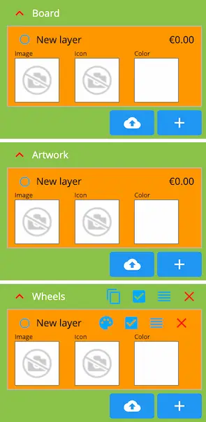
Next up, we add different options to each group
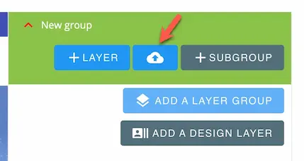
We can add options individually by clicking this button
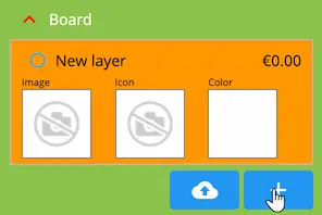
Then, an empty option will be created. We can click on the empty image and empty icon to import a file.
The supported file types are: svg, png, jpg, jpeg
TIP
Leave the icon image empty if you want to use a color instead
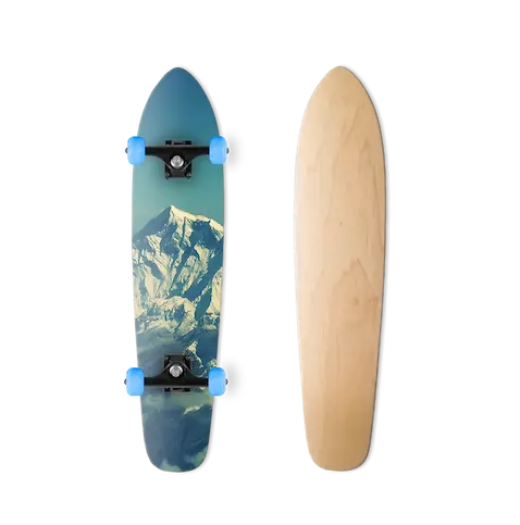
The option image should have a transparent background to allow the graphical superposition of the various visual options.
Here are some examples:


When we combine the three images above, we get this result
Importing multiple options
You can import all options at once by clicking the import button then selecting multiple files.

The module will create the necessary options and generate the icons and the names automatically.
Make sure to name your files correctly, because the module will use the file names as the option names when importing multiple files.
After importing the layers, they should look like this
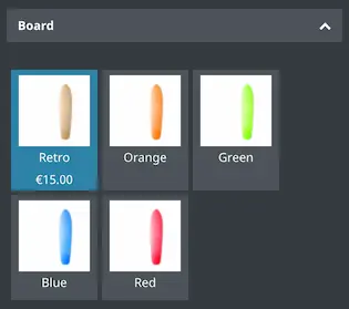
We can edit an option y clicking on its title. This modal will be displayed.
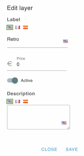
We can change the option label and price as well as its status and its description.
We add the options to other groups in the same way.
# 5️⃣ Initial options
We can pick initial options by clicking this button on the desired options
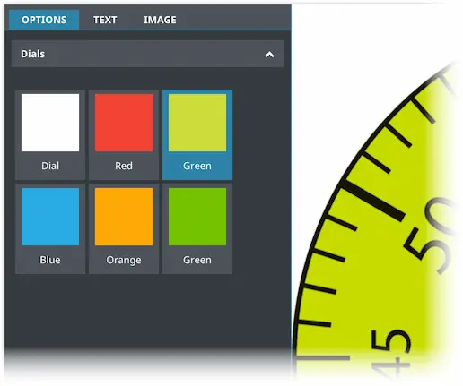
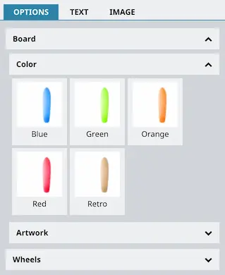
# 6️⃣ Visual options interface
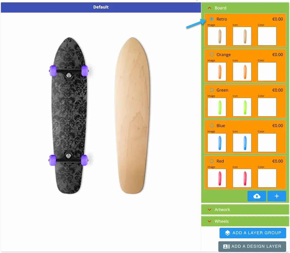
In the designer, the visual options will be displayed like this
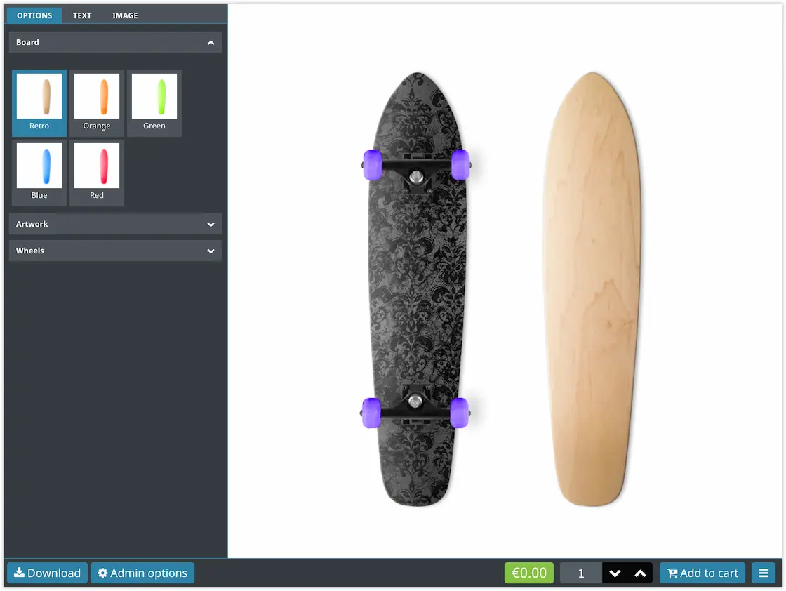
The customer can pick and option from each group to form the desired product.
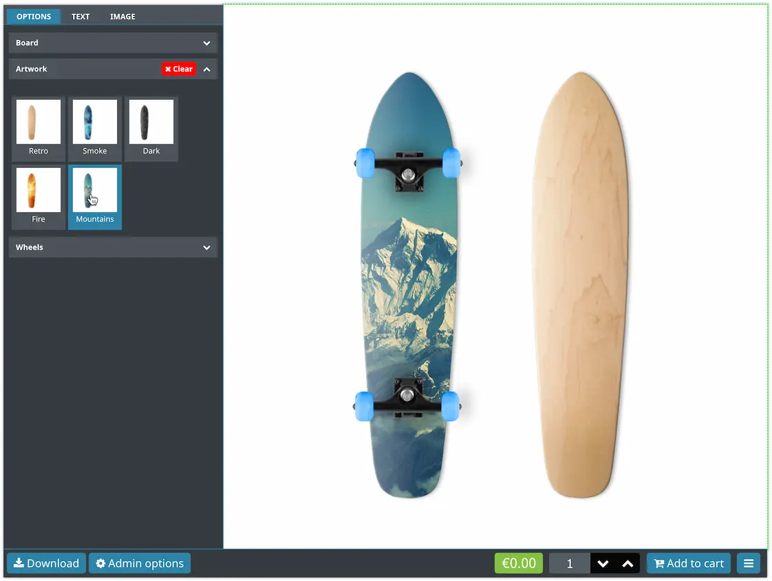
Here's how the price is displayed when the option has a price
# 🎨 Option colorization
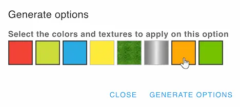
You can generate options by colorizing an image using multiple colors.
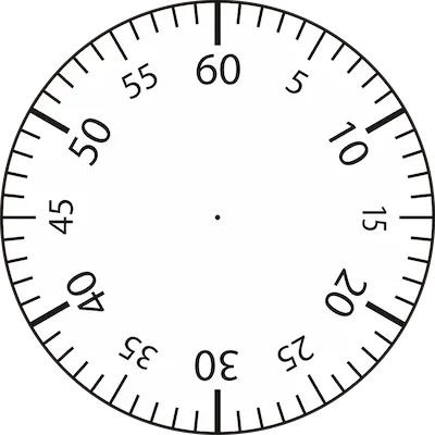
In this example, we will colorize this image
TIP
For an effective colorization, you need to provide the white version of the option
We start by creating an option and adding the image
We then click the desired colors and generate the layers
The module will generate the options like this
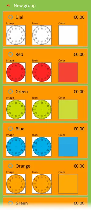
You can delete the icons if you want to display the colors
Here's how the generated options will look
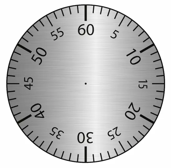
You can also use textures to colorize the option. Make sure that your texture is seamless so that it could be tiled properly over the option image.
Here's an option that was colorized using an aluminium texture
# 🔄 Sync with Dynamic Product
TIP
This option is only available if you have installed the Dynamic Product module
If you want to display visual options in Dynamic Product by
displaying image lists, you can enable
the Sync with Dynamic Product option.
The module will tell you what to name the Dynamic Product field
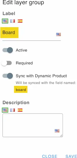
TIP
For the sync to work, the options must use the same images and in the same order
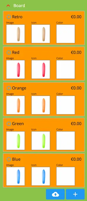
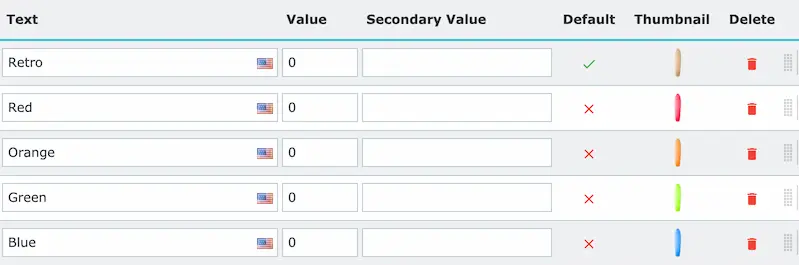
Example:
Board options group in Product Designer
Board image list field in Dynamic Product
The image lists and the designer will be displayed like this
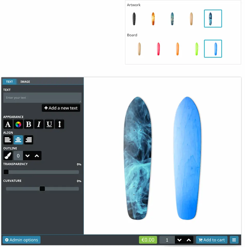
Notice that the Options tab in the designer was hidden to avoid displaying the options twice.
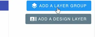
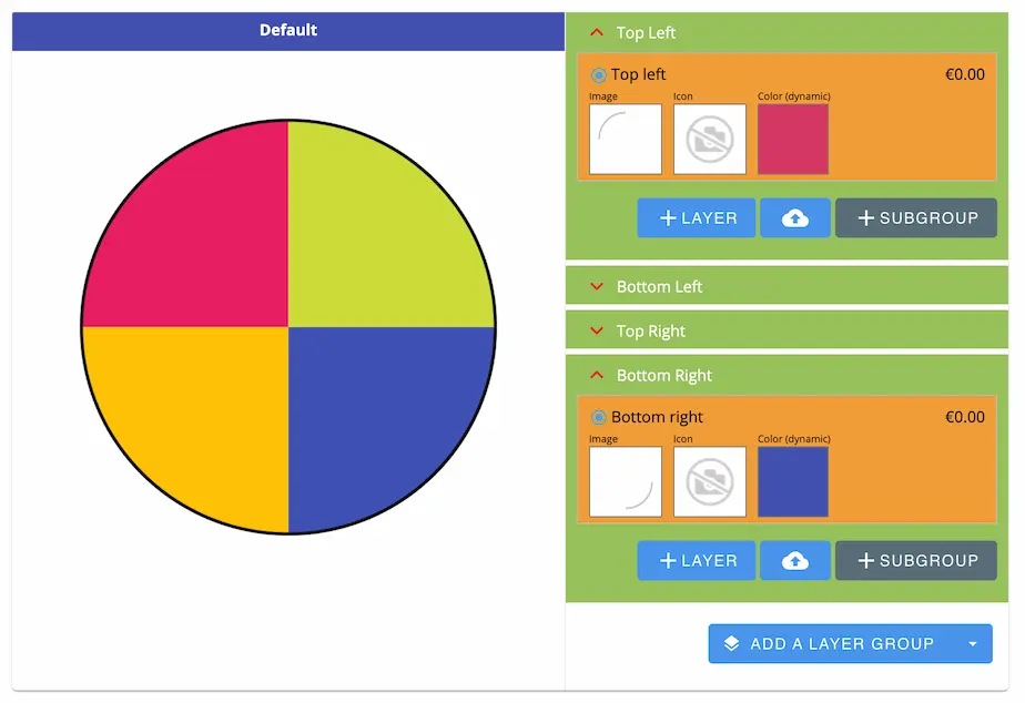
# *️⃣ Using sub-groups
You can add sub-groups to any option group by clicking the subgroup button
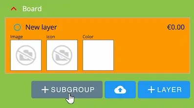
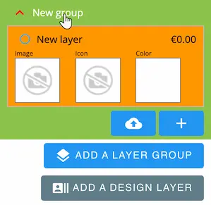
A new sub-group will be added inside the option group
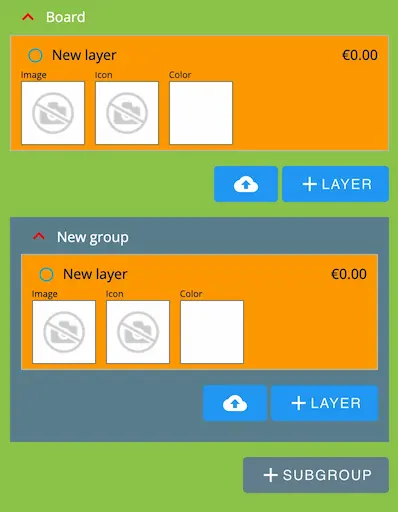
You can add the options and import them as normal, the sub-group is identical to a normal group.
TIP
It's preferred that the parent group does not contain any options but only sub-groups
The sub-groups will be displayed like this
In this case the Board group contains two sub-groups which are Color and Artwork
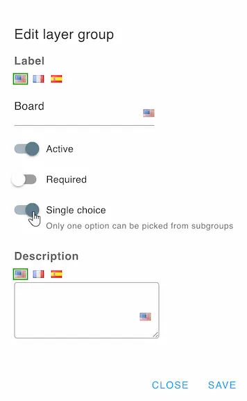
# Single choice
You can enable the single choice setting on the parent group to allow only one option inside the group and its sub-groups to be selected.
TIP
Setting a sub-group that belongs to a single choice group as required will have no effect on the validation.
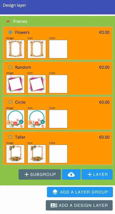
# 🖼 Design layer
By default, the design items will be inserted on top of the visual options layers.
To have more control on the order, you can insert a design layer between the option groups.
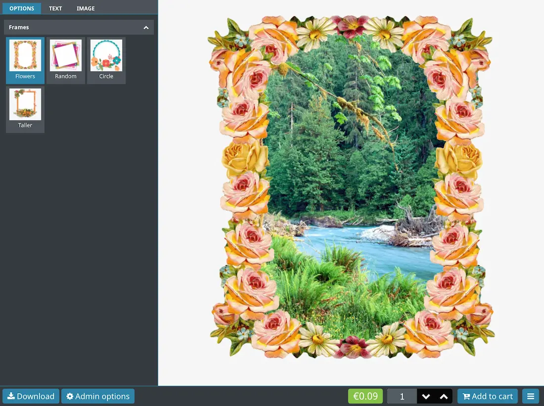
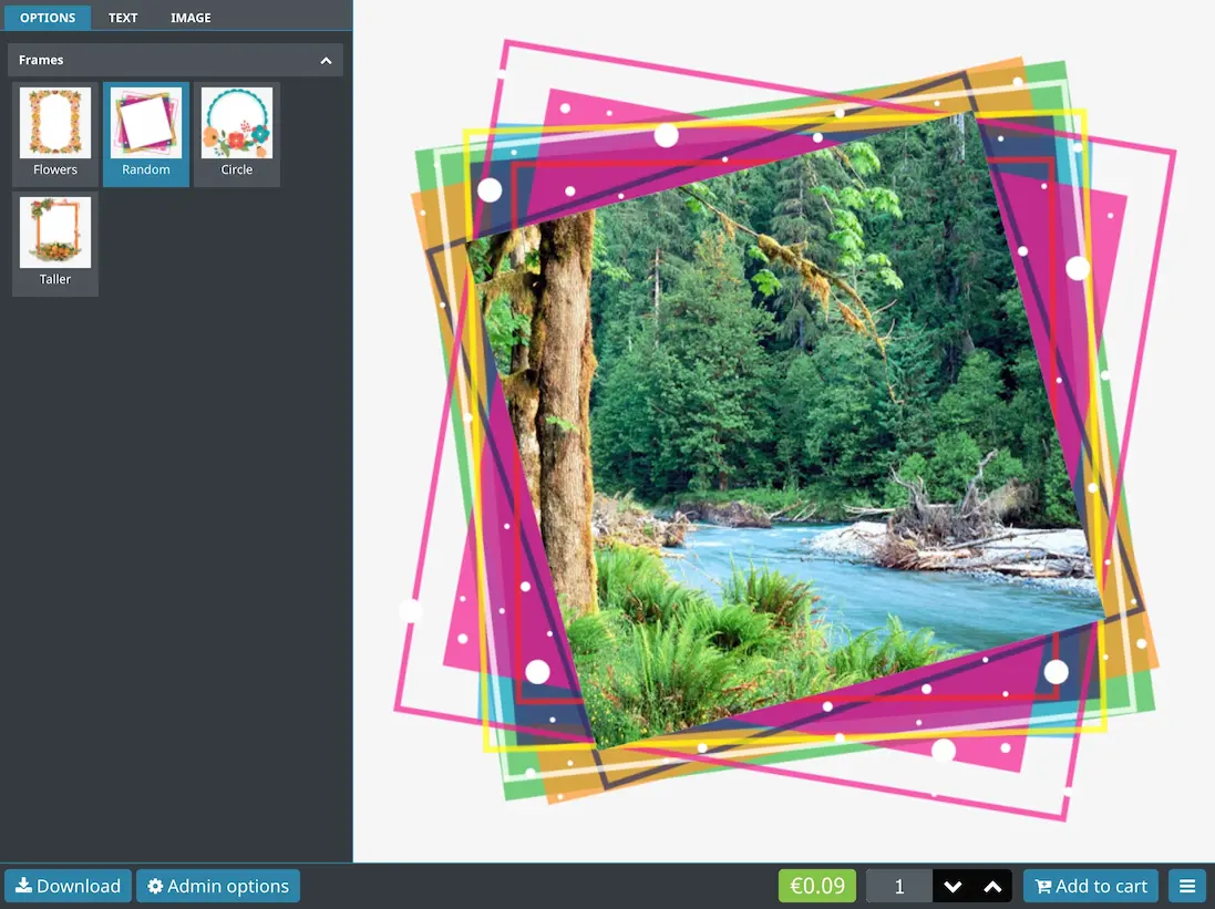
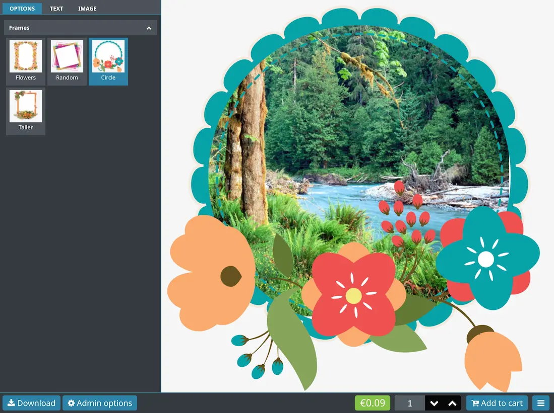
In this example, we want to display the image item under the frame which comes as a visual option.
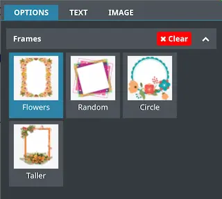
To insert the image under the frame, we can add a design layer and move it to the top of list.
TIP
The visual order on the product page will be reversed. So the top layer will be displayed on the bottom and so on.
The result will look like this depending on the selected frame
# ⬇️ Importing layers
You can import layers by uploading multiple images at once.
You can also import icons by naming the files like this
file1.png
file1-icon.png

file2.png
file2-icon.png

file3.png
file3-icon.png
The module will automatically detect the icon files and import them and assign them to the corresponding image.
TIP
The icon extension does not have to be the same as the image extension.
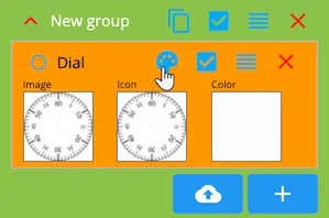
# 🪄 Dynamic colors
If you want to allow the customer to change the color of an option freely, you can enable the
Dynamic colors option in any layer settings.
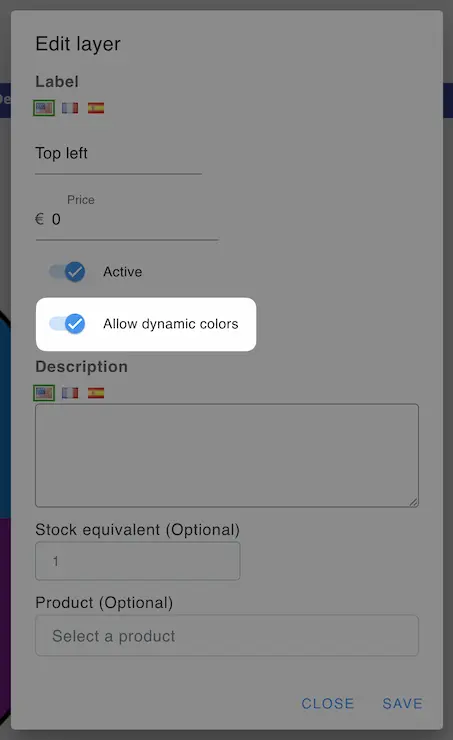
The icon color will be used as the initial color of the layer.
The customer can change the layer color by choosing from the color picker.
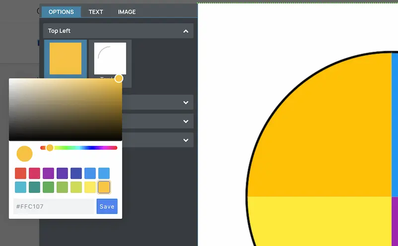
Make sure to use the white version of the layer to allow the colorization to be effective.