# Configuration

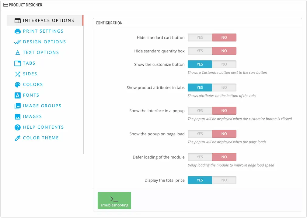
You can change the global settings of the module in the main configuration.
This page contains a configuration that is common to all products, such as the available text colors and fonts etc...

Below are the various configuration sections

# Interface options

# Hide standard cart button

This option hides the PrestaShop cart button so that the customer customizes the product then uses the add to cart button that is inside the module.

Advanced

If the module doesn't succeed in hiding the cart button then it means that your theme has a different html structure compared to the default theme.
For that you can use custom CSS to hide the cart button.
The module adds a class to the body called dsn-hide-cart-button so you can write this CSS for example to hide the cart button

body.dsn-hide-cart-button button.add-to-cart {
  display: none;
}

Customize the CSS selector to work on your theme, this requires CSS knowledge

# Hide standard quantity box

This options hides the PrestaShop quantity box. The user can then enter the quantity in the module interface.

Advanced

Sometimes, the theme has a different html structure than the default theme, so the module can't correctly hide the quantity input.
The solution is to add custom CSS code to hide the quantity input.
The module adds a class to the body which is called dsn-hide-qty-input, so you can write code like this

body.dsn-hide-qty-input div.qty {
  display: none;
}

# Show the customize button

This will display a customize button that when clicked, will show the module interface.

# Show product attributes in tabs

This option will display the PrestaShop attributes inside the module interface.

# Show the interface in a popup

This is useful if you don't want the module to take space on your page or to be initially visible.

TIP

When you enable this option, make sure that the customize button is enabled so that the popup can be accessed.

# Show the popup on page load

Enable this option if you want the customer to start customizing the product right away.

# Defer loading of the module

Enable if you want your product pages to load faster. The module will wait for the page load, then it will load its scripts.

This can help with the page score.

# Display the total price

If enabled, the module will multiply the price by the quantity instead of displaying the unit price.

# Show Dynamic Product in the product tab

This option is only available if you have the Dynamic Product (opens new window) module installed.
It allows you to display the dynamic product fields in the designer interface like this

# Include base image in print

Determines whether to include the base image in the final SVG file.

# Include mask image in print

Determines whether to include the mask image in the final SVG.

# Include layer images in print

Determines whether to include the visual options in the final SVG.

# Include design area only

This option will crop the final SVG to the area size, thus including only the useful part of the design.

# Show preview in invoice Not recommended

Will display the SVG preview in the invoice PDF

WARNING

This option is not recommended being enabled because the PDF library used by PrestaShop does not support SVG files very well.

# Show design details in invoice

Will show more details about the design in the invoice

# Show preview in emails

Will show the design preview in the order confirmation mail sent to the customer

# Design options

# Show download button

Will show a download button allowing the customers to download the design as PNG

# Show design items dimensions

Will show the design item size in centimeters

The customer can change the size by clicking the edit button

# Show item deletion confirmation

Will warn the customer when deleting a design item

# Allow multiple items per design field

Disable this option if you want a design field to only contain one design item

# Minimum DPI for images

Allows you to configure the minimum required DPI for images, thus ensuring a good print quality.

When the image does not have a sufficient quality, its borders will be highlighted in red

An error will be displayed to prevent adding a design which has an image with less than the required DPI

The customer can then reduce the size of the image until all the borders are green

# Disallow designs with low dpi images

If disabled, the module will only show this warning when the design contains an image with insufficient quality

If enabled, then the module will show this error

# Upload max size

This option sets the maximum file size for customer uploads

# Text options

# Show fonts in the text tab directly

If enabled, then the fonts will be displayed directly like this

If it's disabled, the fonts will be displayed behind a button

# Show colors in the text tab directly

If enabled, the text colors will be displayed like this

If it's disabled, the colors will be displayed behind this button

# Hide text size input Active recommended

Will hide the size input

This input will give more control over the outline appearance but in most cases it's not needed

# Hide text style buttons

Will hide these buttons

# Hide text alignment

Will hide these buttons

# Hide text outline

Will hide the outline section

# Image options

# Show colors in the image tab directly

If enabled, the image colors will be displayed like this

If it's disabled, the colors will be displayed behind this button

# Pixabay key

Pixabay is a free image search service. To enable it, you need to configure your key in this field.
To get a Pixabay key, visit the API (opens new window) page, then create an account and copy the key.
You can find the key in the Search Images section (opens new window)

You can then enable Pixabay search for any product of your choice in the product configuration .

# Use Pixabay full size images

This requires full API access, you can get it here (opens new window) (search for full API access)

# Instagram App ID

Create an Instagram App (opens new window) then copy the app id and save it in this field.

# Instagram App Secret

Copy this code from the Instagram App and save it in this field.
For security reasons, treat this code like a password.

# Instagram Redirect Url

Copy the value of this field and save it to your App in this section

TIP

After configuring Instagram settings, you can enable it for the products of your choice by enabling this option

# Tabs

You can enable or disable tabs globally in this section

The tabs are displayed in the interface like this

You can also have a specific tabs configuration for any product of your choice in the Tabs section

# Sides

In this section, you can configure the available sides for your products

You can then enable specific sides for any product in the Sides tab

Here are the side properties

The name is only used in the backoffice to reference the side in other sections of the configuration.

The label will be displayed to customers like this

# Colors

You can configure available colors in this section

These colors will be used for text colors, image colors and product colors.

Here are the color properties

You can also add a texture instead of a plain color. Make sure that your texture file is seamless so that it could be tiled properly by the module.

The colors/textures will be displayed like this in the interface

The module also allows you to choose which colors to enable for each product and also for each feature (text colors, image colors, etc...). This can be done in the Product configuration.

Supported file types

The supported file types for textures are: svg png jpg jpeg

# Fonts

You can add custom fonts in this section

Here's the font properties

TIP

Upload the font file and the module will detect the name and the family name

Supported file types

The supported file types are .otf and .ttf

You can import multiple fonts at once by clicking this icon

The fonts will be displayed like this in the interface

# Image groups

You can add image groups will contain the images that the customer can pick from and add to the design.

Here's the image group properties

The image groups will be displayed like this

# Parent group

The group can either belong to the root category or to another group

In this example the Mountains group belongs to the Nature group, it will be displayed like this

# White image group

Enable this option if the group will contain only white images. This is useful if you want to provide images that the customer can colorize using the Image colors feature.
Images that belong to this group will be automatically colored using the first available color when inserted in the design.

# Bulk import

You can import multiple image groups by clicking this icon

# Images

You can add images that the customer can pick from and add to the design.

Here's the image properties

The images will be displayed when the customer opens the corresponding image group

# Shapes

You can add shapes to be used to crop images in the designer

The shapes will be displayed like this when the customer adds an image to the design

You can enable the shapes for the products of your choice in the product configuration

TIP

The shape will be applied as a SVG mask.

Everything under white pixels will be visible.
Everything under black pixels will be invisible.
Shades in between white and black will apply a transparency effect relative to how light the shade is.

It's recommended to use white shapes with a black contour/stroke.

The shape will be stretched to fill the current image.

# Help content

In this section, you can configure different help areas in the interface

# Image upload help

The image upload help will be displayed like this

# Text help

The text help will be displayed like this

# Image upload terms

The image terms will be displayed like this

# Color theme

In this section, you can customize the interface appearance to better match your theme

Furthermore, you can open the color configurator from any product that has the module enabled and edit the color theme directly in the product page.

# Configs (Specific product configurations)

This tab will only be displayed if you have specific product configurations.

The main configuration of the module affects all products by default, but if you want to customize it, you can open the desired product, then click the configuration button.

The specific configuration page will be opened

The available tabs in the specific configuration are:

In the Configs tabs, you can view the list of the products that have a specific configuration and you can delete any unneeded configuration.